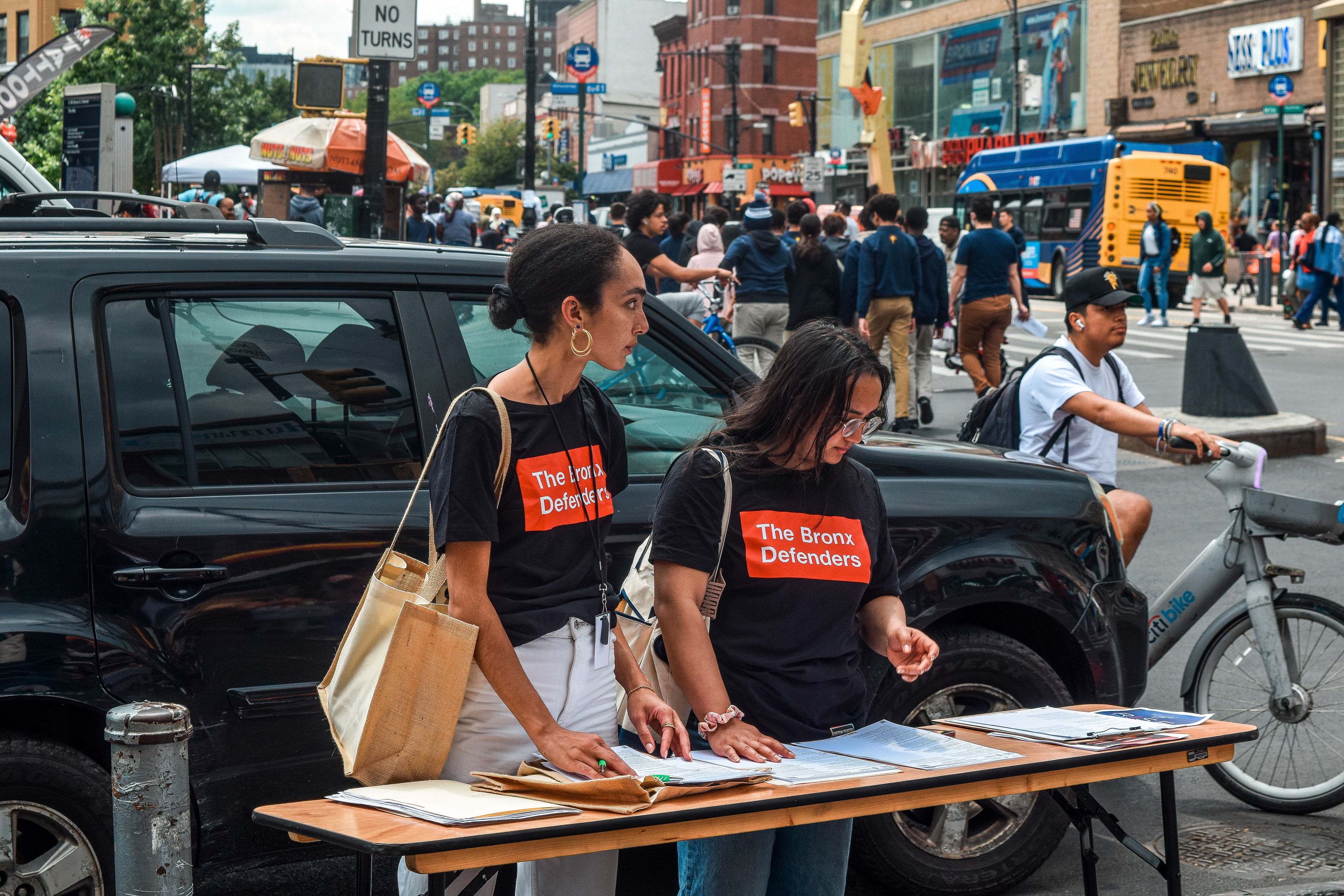
OVERVIEW 
The Bronx Defenders is a public defender nonprofit that is radically transforming how low-income people in the Bronx are represented in the justice system and, in doing so, is transforming the system itself. 
We created a strong, simple identity that clearly communicates the success of The Bronx Defenders' purpose. The logo originates from the organization’s selection of typeface preferences which is Futura, along with their signature colors red and black. The number 25 represents the years that the organization has been making history to change the system. 
For the brochure and swag items, we aimed to highlight the accomplishments and purpose of the organization by using typography, images, hierarchy, and colors.
ROLE
Research, Design, and Concept Ideation.
TOOLS
Adobe Illustrator, Light Room, and Indesign. 
REFINE VERSIONS OF SKETCHES

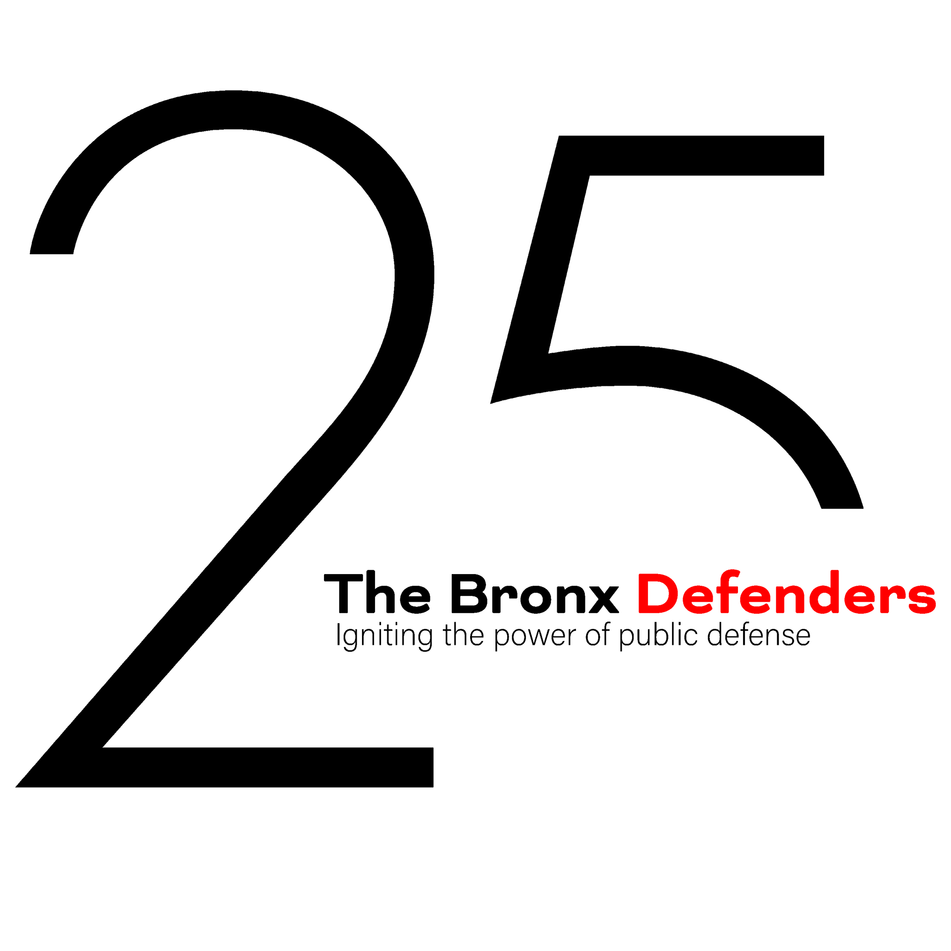
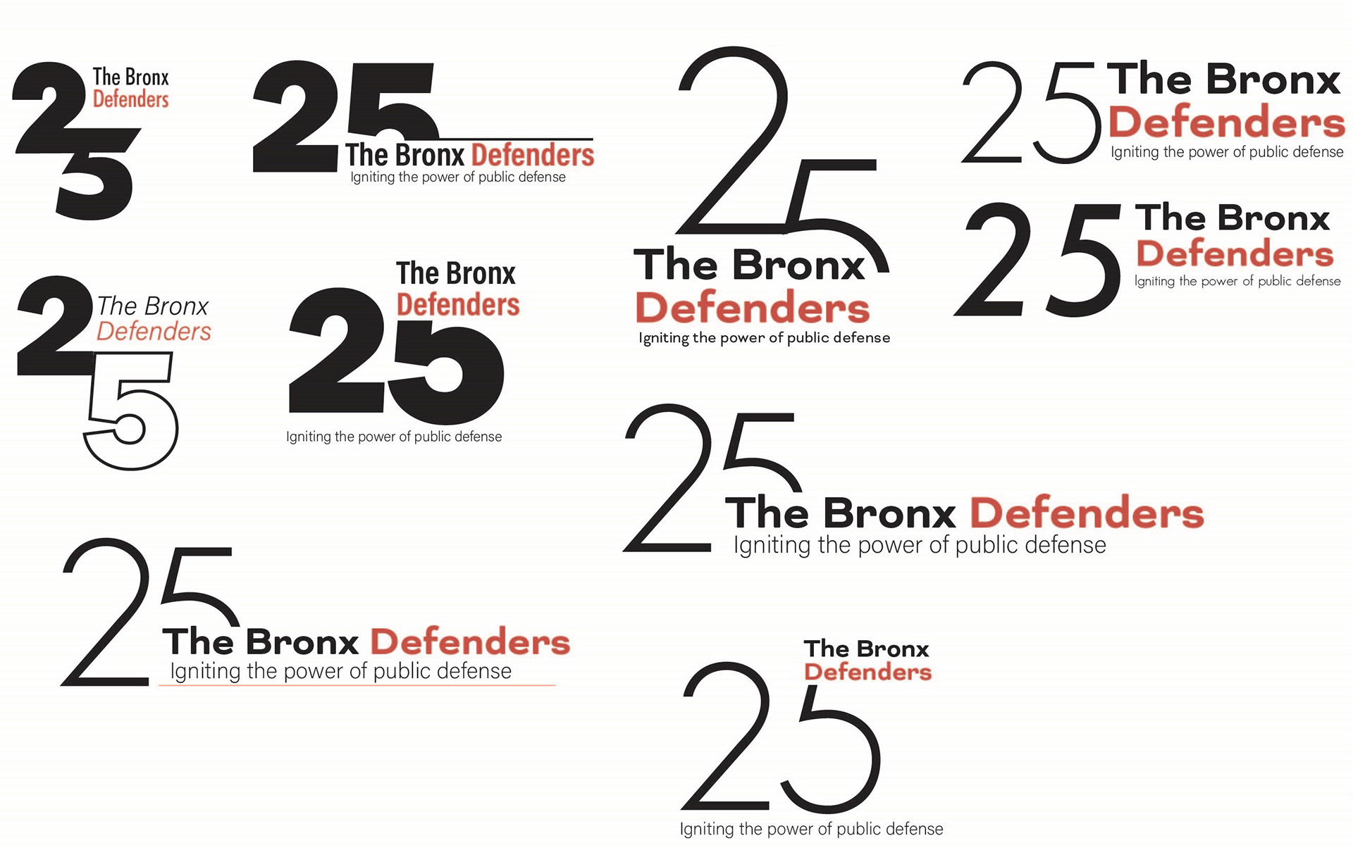
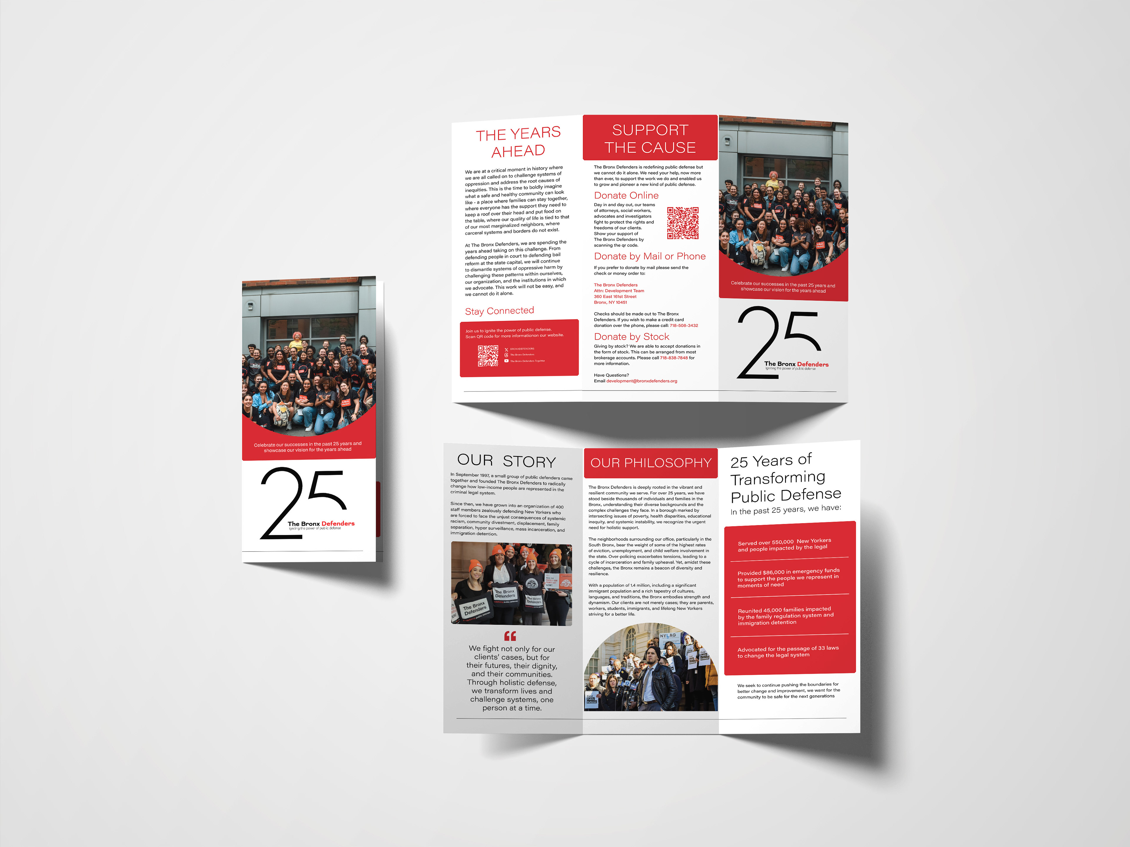
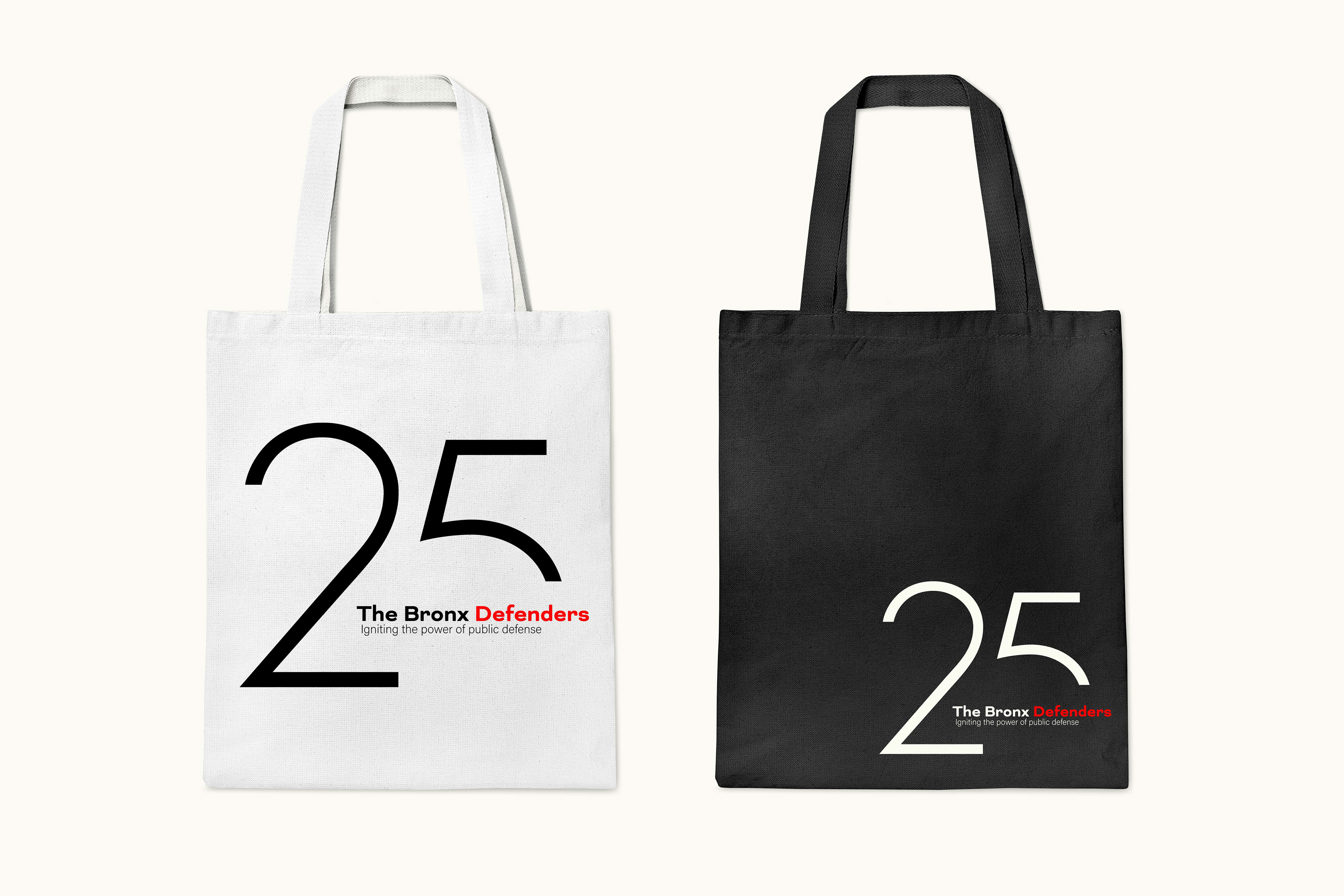
Refine version of logo ideas. 

You may also like

Back to Top